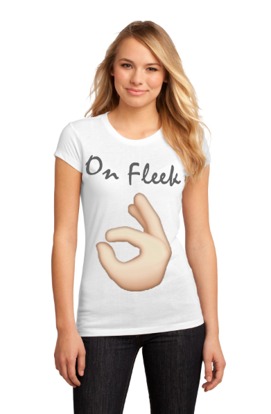
this is my Tee-Shirt #3 Project. rating this project 1-10, 10 being the highest i would rate this a 9 because it makes sense with the project directions and it looks good, my favorite part of this project is that it is funny and the text for the words On Fleek are pretty. if i could change something about this project i would not really do anything because i like the way it turned out. tools i used for this project are the quick selection tool to get the emoji hand, the move tool to move everything, and the text tool to put text on it,. and i didn't learn anything new on this project.
This is my Tee-Shirt #2 Project. rating this project 1-10, 10 being the highest i would rate this a, 8 because it looks really good and makes sense with the project directions. my favorite part of this project is that its colorful and looks good. if i could change something about this project i would, maybe change the colors of the YOLO text. tools i used for this project are the text tool for the yolo righting, and the quick selection tool for the peace sign, and the move tool to move everything where i wanted it. one thing i learned in this project is really nothing because i used all the skills i already knew to make it.

This is my Tee-shirt #1 Project. rating this project 1-10, 10 being the highest oi would rate this project a 9 because it is kinda funny and looks good. my favorite part of this project is that the heart is see threw so you can see the word Bae on the back of it. if i could change something about this project i would maybe make the shirt a different color. the tools i used are the text tool for the word bae, the quick selection tool for the heart, and the move tool to move the stuff around. one thing i learned in this project is ho to change the opacity of an object on top of the other image and make it look see threw.

This is my Out Of Bounds project. rating this Project 1-10, 10 being the highest i would rate this project a 9 because it looks really good and turned out the way i wanted it.my favorite thing on this project is how the elephant looks like it is jumping out of the picture. if i could change something on this protect o would change the shape of the white part around the elephant. tools i used on this project are the, quick selection tool to select part of the elephant so it looks like it is going out of the screen, and the eraser tool to erase some stuff, and the move tools too move the elephant. one thing i learned in this project is how to make things look like they are running out of the picture.

This is my Grasshopper Lawn Care Logo project. rating this project 1-10, 10 being the highest i would rate this project a 8 because i like how the logo looks on the truck and the logo its self. my favorite part of this project is the way it looks on the care it looks cool. if i could change something on this project i wold put it on a different car, the car looks a little funny, tools i used on this project are the text tool for the text on the logo, the brush tool for the grass on the logo on the car, and the move tool to move the logo on to the car, one thing i learned in this project is how to put an image you made and put it on another image.

This is my Concert Poster Project. Rating the Project 1-10, 10 being the highest i would rate this project a 9 because it looks really good. my favorite part of this project is its really colorful and it looks really good, i'm proud of it. if i could change something about this i would put the places that would be preforming but i forgot. the tools i used for this project are the move tool to move all the things around, the quick selection tool to quick select the text Katy Perry and Katy Perry herself, and the eraser tool to erase some stuff. one thing i learned on this project is how to change the opacity and the color to the background to make it look better.

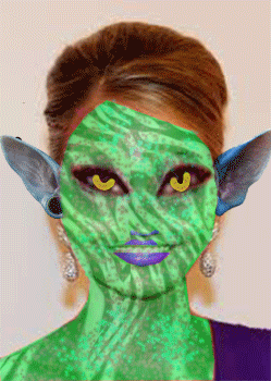
This is my Alien GIF project, rating this project 1-10, 10 bring the highest i rate it a 8 because i like the way it turned out a lot but their are some spots i could have done better on. my favorite part about this project is to see how it looked like in the beginning to the end how it looked like, just the transformation is cool. something i wish i would have done differently on this project is, around the lips and the nose were is it purple looks bad so i don't like how that tuned out. three tools i used or this project is, the brush tool for the color is some parts of the face, i also used the, rectangle tool, i used that to get so the pattern in the face looks like a zebra. and the last tool i used is the, quick selection tool to take the ears out and put them on it. one thing i learned doing this project is how to make it go from the beginning to the end and how it looks throughout the processes.
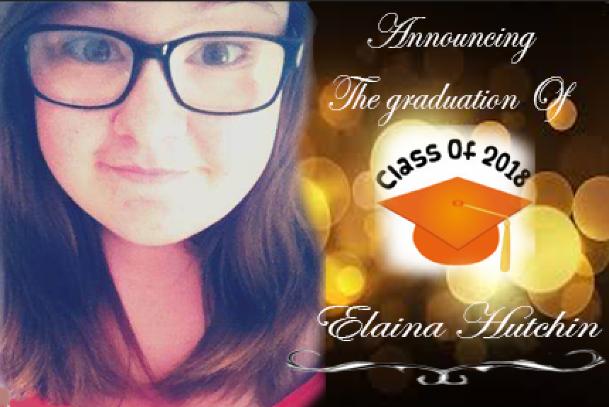
This is my Graduation Announcement Project, rating this project 1-10, 10 being the highest i would rate this project a 7 because i like the way it turned out but it is lacking some creativity i think. my favorite part of this project is the righting i like how it looks and it fits well with the background and everything else. if i could do something differently on this project i would make it look more creative maybe but some stuff on the borders or something. three tools i used on this project are, the quick selection tool so i could move myself and the class of 2018 stamp on the picture, also i used the eraser tool to erase some of the edged around my face and around the class of 2018 stamp. and the last tool i used is the type tool make put all the wringing i put the project. one thing i learned form this project is how to put a background on a project and other stuff on it to make it look good.
This is my Be yourself project, rating this project 1-10, 10 being the highest i rate this 7 because i like the way it turned out it looks super cool but i could have done a little better by fixing some stuff. my favorite part of this project is i make it look like i am taking off my face and the mask looks like it is plastic and that's cool.if i could do something different in this project i would make the face mask look neater because it looks rough. three tools used on this project are, the gradient tool for the background to be a different color. the pen tool to take off my face and make two of them so it looks like i am taking off my face. and finally the last tool i used is the quick selection tool to take myself out of the other picture and put it on this one. two things i learned on thins project is how to use two tools, the pen tool and the gradient tool.

This is my Digital magazine cover project, rating this project 1-10, 10 being the highest i rate this project 10 because i really like how it turned out and it really looks like the original. my favorite part of this project is that it looks like a actual magazine cover not like some of the other stuff it really looks good. if i could do something differently in this project it would be, moving the swirly line by his mouth over of fixing them a little more. three tools i used are, the type tool for the text in the picture, i also used the, move tool to move everything around in the right spot. and the last tool i used is the, bold tool on the text to make some of them bold. one thing i learned in this project is, on the word digital the pattern of the electrical thing is on the back and i learned how do to that.

This is my Multiplicity project, rating this project 1-10, 10 being the highest i would rate is 9 because oi really like how it turned out, i didn't thing that i could make something like this so i am proud of myself, and it turned out really good. my favorite part of this project is that when i put myself in the picture it looks like i'm in their it doesn't look fake. if i could do something different in this project i would pose differently and make it look a little better. three tools i used doing this project are the quick selection tool to put myself in their more than one time, the other is the move tool to make myself and make myself look smaller/bigger so it looks realistic. and finally the last tool i used is the erase tool to erase some spots that i didn't want their anymore. one thing that i learned making this project is, i had to find places in the hall that already had shadows to make it look like it was my shadow so it looked real.

this is my Magazine cover project. rating this project 1-10, 10 being the highest i would rate it a 5 because i don't like the way it turned out, it looks boring or just not colorful enough. my favorite part about this project is that i combined all the things i learned in Photoshop and it turned out pretty good. something i would do different if i could is actually fallow the rubric and get a better grade. three different tools i used are the text tool an with the test too i used the warp text to make the text look different. another is the quick selection tool that i used to take Brooke out of the picture, and also the flowers. and finally the last tool i used is the spot healing brush to fix some of the mistakes i made on the quick selection tool, it jut made it look a little neater. one thing i learned during this project is, how to make the text look different.

This is my Superhero project. rating this project 1-10, 10 being the highest i rate it 7 because i tried my best but i had to use the same picture twice. but other than that it looks good and i got a good grade. my favorite part of this project is,that it turned out really good, better than i thought it would have turned out. if i could do something differently on this project i would have used a different picture at the bottom one. Three tools i used are, the quick selection tool to put myself on the picture and the fireballs, and the text tool to make the texts that say, student by day superhero by night, and lastly the brush tool, i used it to color in the area that was all white so it didn't look bad. One thing i learned doing this project is, i learned how to use the text tool more, and hot to make effects on the different texts.

